When an Excel file contains hundreds or thousands of rows, finding useful information can quickly become difficult. A sales manager may want to know which region is performing best, an HR team may want to track employee turnover, or a business owner may simply want to see whether revenue is increasing month by month.
This is where an Excel dashboard becomes useful.
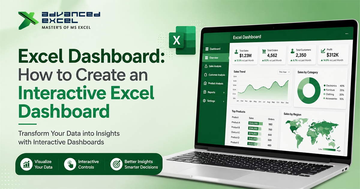
Instead of presenting users with a large spreadsheet full of numbers, an Excel dashboard brings important information together through KPIs, charts, PivotTables, filters, and interactive controls.
The best part is that you can create a powerful dashboard using Excel itself. You don’t always need Power BI or another business intelligence platform.
In this guide, you’ll learn how to create an interactive Excel dashboard from raw data, which Excel features are useful, how to connect slicers to your reports, and how to design a dashboard that is actually easy to use.
What Is an Excel Dashboard?
An Excel dashboard is a visual summary of data that allows users to monitor important metrics, identify trends, compare performance, and sometimes interact with the data through filters.
A typical dashboard may contain:
- KPI cards
- Charts and graphs
- PivotTables
- Slicers
- Timelines
- Dropdown filters
- Conditional formatting
- Summary tables
- Excel formulas
For example, a sales dashboard could show:
Total Sales | Total Profit | Orders | Profit Margin
along with:
- Monthly sales trend
- Sales by region
- Sales by product
- Top-performing salespeople
- Region and product filters
Instead of going through the complete sales database, the user gets a summarized view on one screen.
Why Should You Create an Excel Dashboard?
A spreadsheet can store a huge amount of information, but storing data and understanding data are two different things.
A dashboard helps bridge that gap.
Faster Data Analysis
Users can see important numbers and trends without manually filtering thousands of records.
Better Decision-Making
A good dashboard highlights what is happening in the business and where attention may be needed.
Easier Reporting
Instead of preparing the same report manually every month, you can create a reusable dashboard and refresh the underlying data.
Interactive Data Exploration
With slicers and timelines, users can change the view without changing the original data.
For example:
Select “North” ? view North region performance
Select “Laptop” ? view Laptop sales
Select “January–March” ? analyze the first quarter
This is what makes an interactive Excel dashboard different from a normal static report.
What Does a Good Excel Dashboard Look Like?
Before opening Excel and adding charts, think about what the dashboard needs to accomplish.
A good dashboard should answer important questions quickly.
For a sales dashboard, those questions might be:
- How much did we sell?
- How much profit did we generate?
- Which region performed best?
- Which products generated the most revenue?
- How are sales changing every month?
- Which salesperson is performing above target?
The dashboard should be designed around these questions.
A Simple Dashboard Structure
A practical layout could be:
Dashboard Header
?
KPI Cards
Total Sales | Profit | Orders | Margin
?
Interactive Filters
Year | Region | Product | Salesperson
?
Main Charts
Monthly Sales Trend | Regional Performance
?
Supporting Analysis
Product Performance | Salesperson Performance
This structure keeps the most important information at the top and detailed analysis below it.
Excel Dashboard Example: Sales Data
Let’s use a simple sales dataset to understand the process.
Your source data might look like this:
| Date | Region | Salesperson | Product | Category | Quantity | Sales | Profit |
|---|---|---|---|---|---|---|---|
| 05-Jan-2026 | North | Rahul | Laptop | Electronics | 5 | 250000 | 35000 |
| 08-Jan-2026 | South | Priya | Monitor | Electronics | 8 | 120000 | 18000 |
| 12-Jan-2026 | West | Amit | Keyboard | Accessories | 20 | 40000 | 8000 |
| 18-Jan-2026 | East | Neha | Laptop | Electronics | 3 | 150000 | 21000 |
A real business dataset may contain thousands of similar rows.
The goal is not to put all these rows onto the dashboard.
The goal is to summarize them into information that matters.
Step 1: Prepare and Clean Your Excel Data
Before creating your dashboard, clean the source data.
Look for:
- Duplicate records
- Blank rows
- Missing values
- Incorrect dates
- Inconsistent spelling
- Incorrect number formats
- Unnecessary columns
For example, these values should ideally be standardized:
North
north
NORTH
Similarly, make sure dates are stored as actual Excel dates rather than text.
Why Is Data Cleaning Important?
If your source data is inconsistent, your PivotTables, charts, and formulas may produce misleading results.
A dashboard cannot fix poor-quality source data.
Step 2: Convert Your Data Into an Excel Table
Select the complete dataset and press:
Ctrl + T
Make sure My table has headers is selected.
Then give the table a meaningful name, such as:
SalesData
You can change the name from:
Table Design ? Table Name
Using an Excel Table is particularly useful when your data will continue to grow.
For example, if you add new sales records next month, the table can automatically expand to include them.
Step 3: Decide Which KPIs Your Dashboard Needs
Don’t start by creating charts.
Start with the numbers that matter.
For a sales dashboard, you might select:
Total Sales
Shows total revenue generated.
Total Profit
Shows the amount of profit generated.
Total Orders
Shows the number of transactions.
Units Sold
Shows total quantity sold.
Profit Margin
Shows profitability relative to sales.
For example:
Total Sales: ?1.25 Cr
Total Profit: ?22 Lakh
Orders: 8,450
Profit Margin: 17.6%
These can be displayed as KPI cards at the top of the dashboard.
Step 4: Create PivotTables
PivotTables are one of the most important Excel features for dashboard creation.
Go to:
Insert ? PivotTable
Select your SalesData table.
Now you can create different summaries from the same source data.
Example: Sales by Region
Put:
Region ? Rows
Sales ? Values
Excel will summarize sales for each region.
Example: Sales by Product
Put:
Product ? Rows
Sales ? Values
Example: Monthly Sales
Put:
Date ? Rows
Sales ? Values
You can group dates by month or year if required.
Create these PivotTables on a separate worksheet such as:
Dashboard Data
This keeps the dashboard itself cleaner.
Step 5: Create PivotCharts
Once your PivotTables are ready, convert the important summaries into charts.
Select the PivotTable and choose:
Insert ? PivotChart
The chart type should depend on the information you’re trying to communicate.
Use a Column Chart for Comparisons
Example:
Sales by Region
This makes it easy to compare North, South, East, and West.
Use a Line Chart for Trends
Example:
Monthly Sales Trend
A line chart is useful for showing whether sales are increasing, decreasing, or fluctuating.
Use a Bar Chart for Rankings
Example:
Top 10 Products by Sales
Use a Doughnut Chart Carefully
A doughnut chart can show simple proportions, but it becomes difficult to read when you have many categories.
Don’t choose a chart simply because it looks attractive.
Choose the chart that makes the data easiest to understand.
Step 6: Add Slicers to Your Excel Dashboard
Now we can make the dashboard interactive.
A Slicer provides clickable filtering buttons for PivotTables and PivotCharts.
For example, you could add slicers for:
- Region
- Product
- Category
- Salesperson
- Year
To insert a slicer:
Select PivotTable ? PivotTable Analyze ? Insert Slicer
Select the fields you want.
For example:
Region
The dashboard may now display:
North | South | East | West
When the user clicks North, the connected dashboard components can automatically filter to North.
This is one of the easiest ways to create an interactive dashboard in Excel.
Step 7: Connect One Slicer to Multiple PivotTables
This is an important step if your dashboard contains several PivotTables.
Suppose your dashboard has:
- Sales by Region
- Sales by Product
- Profit by Region
- Monthly Sales
You may want one Region slicer to control all these reports.
Select the slicer and choose:
Slicer ? Report Connections
Then select the PivotTables you want it to control.
Now, selecting a region can update multiple dashboard elements simultaneously.
This creates a much smoother user experience.
Step 8: Add a Timeline for Date-Based Analysis
If your dashboard contains dates, use an Excel Timeline.
Go to:
PivotTable Analyze ? Insert Timeline
Select the Date field.
A Timeline allows users to filter data by:
- Years
- Quarters
- Months
- Days
For example, a user can select:
Q1 2026
and immediately analyze the relevant sales data.
This is especially useful for sales, finance, inventory, and performance dashboards.
Step 9: Create KPI Cards
KPIs should be easy to see.
A common dashboard design is:
| Total Sales | Total Profit | Orders | Profit Margin |
|---|---|---|---|
| ?1.25 Cr | ?22 Lakh | 8,450 | 17.6% |
You can create these using formulas and cells, or use shapes linked to cells.
For example, a total sales value can be calculated using:
=SUM(SalesData[Sales])A profit calculation could be:
=SUM(SalesData[Profit])The exact formulas will depend on your dataset.
Keep KPI Cards Simple
Avoid putting too much information into one card.
The user should immediately understand:
What is the metric?
What is the current value?
If you’re tracking targets, you can also show:
Actual vs Target
or
Current Month vs Previous Month
Step 10: Use Conditional Formatting
Conditional formatting is useful when you want Excel to automatically highlight performance.
For example:
| Salesperson | Target | Actual | Status |
|---|---|---|---|
| Rahul | ?5,00,000 | ?6,20,000 | Achieved |
| Priya | ?5,00,000 | ?4,40,000 | Below Target |
| Amit | ?5,00,000 | ?5,80,000 | Achieved |
You can use conditional formatting to highlight values based on rules.
Useful options include:
- Data Bars
- Icon Sets
- Color Scales
- Custom Formula Rules
Don’t use formatting everywhere, though.
Highlight only information that needs attention.
Step 11: Add Dropdown Filters When Needed
Slicers are excellent for PivotTable-based dashboards, but dropdown lists can also be useful.
You can create one using:
Data ? Data Validation ? List
For example:
North, South, East, West
Then use the selected value in formulas to dynamically change a result.
This approach can be useful when you’re creating a dashboard with formula-driven reports rather than relying entirely on PivotTables.
Step 12: Organize Your Dashboard Layout
Now bring your components together.
A practical Excel dashboard can have three sections.
Section 1: Summary
Place:
- Total Sales
- Total Profit
- Orders
- Profit Margin
at the top.
Section 2: Filters
Place:
- Year
- Region
- Product
- Salesperson
below or beside the KPI section.
Section 3: Analysis
Use:
- Monthly trend chart
- Regional comparison
- Product performance
- Top salesperson table
Avoid filling every available space.
A dashboard needs enough white space so users can distinguish between different sections.
Step 13: Remove Unnecessary Visual Clutter
A professional dashboard doesn’t need lots of decoration.
Consider removing:
- Unnecessary gridlines
- Excessive borders
- Repeated labels
- Large legends
- 3D chart effects
- Unnecessary background elements
Keep fonts, spacing, headings, and chart styles consistent.
The goal is simple:
Make the data easier to understand.
Step 14: Test Your Interactive Excel Dashboard
Before sharing the dashboard, test it properly.
Click every slicer.
Change the date range.
Check different regions.
Select individual products.
Then ask:
- Are all charts updating?
- Are the KPI values changing correctly?
- Are filters connected to the right PivotTables?
- Are totals accurate?
- Are dates working correctly?
- Are any charts showing blank or incorrect values?
This testing step is important because a dashboard can look perfect while still producing incorrect results.
Useful Excel Formulas for Dashboard Creation
You can create dashboards using PivotTables alone, but formulas can make them more flexible.
SUMIFS
Use SUMIFS when you need a calculation based on one or more conditions.
Example:
=SUMIFS(SalesData[Sales],SalesData[Region],"North")This calculates sales for the North region.
COUNTIFS
Useful for counting records based on multiple conditions.
=COUNTIFS(SalesData[Region],"North",SalesData[Status],"Completed")XLOOKUP
Useful when you need to retrieve information from another table.
=XLOOKUP(A2,ProductTable[Product],ProductTable[Price])IF
Useful for performance indicators.
=IF(C2>=B2,"Target Achieved","Below Target")For larger dashboards, formulas can also be combined with Excel Tables, named ranges, dynamic arrays, and other functions.
Excel Dashboard Without VBA: Is It Possible?
Yes.
You can create a highly interactive Excel dashboard without writing VBA.
Some of the most useful features are:
- Excel Tables
- PivotTables
- PivotCharts
- Slicers
- Timelines
- Data Validation
- Conditional Formatting
- SUMIFS
- COUNTIFS
- XLOOKUP
- Power Query
VBA becomes useful when you need more customized automation or actions that aren’t easily handled with Excel’s built-in features.
So if you’re a beginner, don’t start with VBA just because you want to build a dashboard.
Learn the core Excel tools first.
Can Power Query Be Used With an Excel Dashboard?
Yes.
Power Query can be extremely useful when the dashboard receives data regularly from different sources.
For example, suppose you receive a monthly sales file.
Instead of manually:
- Opening the file
- Cleaning the data
- Removing unnecessary columns
- Fixing formats
- Combining data
- Updating the report
you can create a Power Query process that performs much of this work automatically.
The cleaned output can then feed your PivotTables and dashboard.
This is one reason Excel + Power Query is a powerful combination for recurring reporting.
Excel Dashboard vs Power BI Dashboard
Excel isn’t the only tool for dashboards.
Power BI is another popular option.
| Feature | Excel Dashboard | Power BI |
|---|---|---|
| Spreadsheet analysis | Excellent | Good |
| PivotTables | Yes | No |
| Interactive filters | Yes | Yes |
| Large datasets | Limited compared with BI platforms | Better suited |
| Data modeling | Power Pivot available | Strong |
| Advanced visualizations | Moderate | Extensive |
| Familiarity | Very high for Excel users | Requires learning |
| Quick ad-hoc analysis | Excellent | Good |
This doesn’t mean one tool is always better.
For smaller datasets, departmental reports, financial analysis, and users already comfortable with Excel, an Excel dashboard can be more than enough.
For larger data models, advanced visualizations, centralized reporting, and broader business intelligence requirements, Power BI may be a better fit.
Types of Excel Dashboards You Can Create
The same techniques can be used across many industries.
1. Sales Dashboard
Track:
- Revenue
- Profit
- Orders
- Products
- Regions
- Salespeople
2. HR Dashboard
Track:
- Employee count
- Attrition
- New hires
- Departments
- Attendance
- Employee performance
3. Finance Dashboard
Track:
- Revenue
- Expenses
- Profit
- Budget
- Actual vs budget
- Cash flow
4. Marketing Dashboard
Track:
- Leads
- Conversions
- Campaign performance
- Cost per lead
- Conversion rate
- ROI
5. Inventory Dashboard
Track:
- Current stock
- Low-stock items
- Inventory value
- Product movement
- Purchase orders
6. Project Management Dashboard
Track:
- Completed tasks
- Pending tasks
- Project status
- Deadlines
- Team performance
7 Practical Tips for Better Excel Dashboards
1. Start With the Business Question
Don’t ask:
“Which charts should I add?”
Ask:
“What does the user need to know?”
That change in thinking can significantly improve the dashboard.
2. Keep Important Information Above the Fold
KPIs and the most important charts should be visible without excessive scrolling.
3. Don’t Use Every Excel Feature
Just because Excel has dozens of chart types doesn’t mean you need to use them.
4. Keep Filters Relevant
Five useful filters are better than fifteen confusing ones.
5. Use Consistent Formatting
Keep fonts, headings, spacing, and number formats consistent.
6. Make Numbers Easy to Read
Instead of:
12500000
use:
?1.25 Cr
when appropriate for your audience.
7. Refresh and Test the Dashboard Regularly
If the source data changes frequently, establish a simple refresh process and verify that the dashboard still works correctly.
Common Excel Dashboard Mistakes
Too Many Charts
A dashboard isn’t supposed to contain every analysis you’ve ever created.
Poor Data Structure
If the source data isn’t organized correctly, the dashboard will be difficult to maintain.
Excessive Colors
Too many colors can make important information harder to identify.
Using 3D Charts
3D effects often make comparisons harder rather than easier.
No Clear KPI Hierarchy
If every number has the same visual importance, users don’t know where to look first.
Manual Reporting
If you’re copying and pasting numbers into the dashboard every month, look for opportunities to automate the process.
Ignoring Mobile or Smaller Screens
If the dashboard will be shared electronically, check how it looks on the screen where users are likely to view it.
Excel Dashboard Checklist
Before publishing your dashboard, check the following:
-
Source data is clean
-
Data is converted into an Excel Table
-
KPIs are clearly defined
-
PivotTables are accurate
-
Charts answer useful questions
-
Slicers work correctly
-
Timeline works correctly
-
Slicers are connected to required PivotTables
-
Number formats are consistent
-
Dashboard layout is easy to understand
-
No unnecessary charts or decoration
-
Dashboard has been tested with different filters
-
Refresh process is documented
Frequently Asked Questions
What is an Excel dashboard?
An Excel dashboard is a visual report that brings KPIs, charts, tables, filters, and summarized data together in one place to make data easier to understand and analyze.
How do I create an interactive Excel dashboard?
Start with clean source data, convert it into an Excel Table, create PivotTables and PivotCharts, add slicers and timelines, create KPI cards, and organize the elements into a clear dashboard layout.
Can I create an Excel dashboard without VBA?
Yes. PivotTables, PivotCharts, slicers, timelines, formulas, conditional formatting, Data Validation, and Power Query can be used to create interactive Excel dashboards without VBA.
Which Excel features are best for dashboards?
The most commonly used features include Excel Tables, PivotTables, PivotCharts, slicers, timelines, formulas, conditional formatting, Power Query, and Power Pivot.
How do I make my Excel dashboard interactive?
Slicers and timelines are among the easiest ways to make PivotTable-based dashboards interactive. Dropdown lists and formulas can also be used for formula-driven dashboards.
Can Excel dashboards update when new data is added?
Yes, if the dashboard is structured correctly. Excel Tables can expand as new records are added, while PivotTables can be refreshed. Power Query can also automate recurring data-import and transformation processes.
Is Excel good for creating dashboards?
Yes. Excel is particularly useful for departmental reporting, financial analysis, sales reporting, operational tracking, and situations where users already work extensively with spreadsheets.
What is the difference between an Excel dashboard and a regular report?
A regular report often focuses on presenting detailed information, while a dashboard focuses on summarizing important metrics, visualizing trends, and allowing users to interact with the data.
Conclusion
Creating an interactive Excel dashboard is less about making a spreadsheet look attractive and more about making data useful.
Start with clean and well-structured source data. Decide which KPIs matter, summarize the information with PivotTables, choose charts based on the questions you’re trying to answer, and then add slicers and timelines to make the dashboard interactive.
For recurring reports, you can take the process further by using Power Query, Power Pivot, formulas, and automation.
If you’re learning Excel for business reporting or data analysis, dashboard creation is one of the skills worth developing because it combines data preparation, analysis, visualization, and presentation in one practical project.
A good first project is a sales dashboard with four KPI cards, a monthly sales chart, a regional performance chart, product analysis, and slicers for year, region, and product. Once that works, you can use the same approach to build HR, finance, inventory, marketing, and project dashboards.