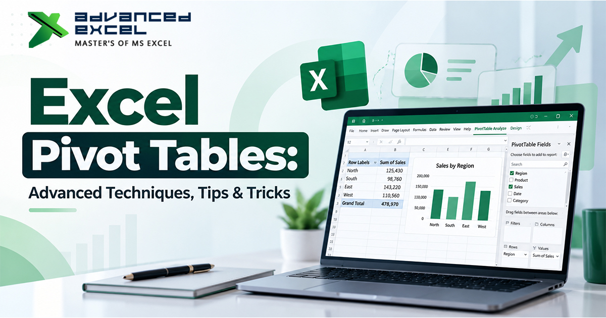
Excel Pivot Tables are one of the most powerful tools for analyzing large amounts of data without writing complex formulas. A properly built Pivot Table can turn thousands of rows of sales, customer, employee, financial, or operational data into a clear and useful report within minutes.
But creating a basic Pivot Table is only the beginning.
Once you understand features such as calculated fields, grouping, slicers, custom calculations, filtering, multiple Pivot Tables, and Pivot Charts, you can use Excel to perform much more advanced data analysis.
In this guide, we will explore advanced Excel Pivot Table techniques, tips, and tricks that can help you build faster, cleaner, and more interactive reports.
What Is an Excel Pivot Table?
An Excel Pivot Table is a data analysis tool that allows you to summarize and reorganize information from a large dataset.
Instead of manually calculating totals, averages, counts, or percentages using formulas, you can drag fields into different areas of a Pivot Table and instantly generate a summary.
For example, suppose you have 20,000 sales records containing:
- Salesperson
- Product
- Region
- Sales Date
- Quantity
- Sales Amount
- Customer Name
A Pivot Table can quickly answer questions such as:
- Which region generated the highest sales?
- Which salesperson achieved the highest revenue?
- Which products are selling the most?
- What were the monthly sales?
- What percentage of total sales came from each region?
- What is the average order value?
This is why Pivot Tables are widely used for Excel data analysis and business reporting.
Basic Structure of an Excel Pivot Table
Before moving into advanced techniques, it is important to understand the four main areas of a Pivot Table.
1. Rows
The Rows area determines how your data is organized vertically.
For example:
Region ? Product
This can display products under each region.
2. Columns
The Columns area creates categories horizontally.
For example:
Month ? Sales
This allows you to compare sales across different months.
3. Values
The Values area contains the calculations.
Depending on your data, Excel can calculate:
- Sum
- Count
- Average
- Maximum
- Minimum
- Product
- Percentage
4. Filters
The Filters area allows you to filter the entire Pivot Table based on a specific field.
For example, you could filter a sales report by:
Year ? 2026
This gives you a quick way to analyze a specific period.
10 Advanced Excel Pivot Table Techniques
1. Group Dates Automatically
One of the most useful Pivot Table features is date grouping.
Suppose your dataset contains individual transaction dates:
| Date | Sales |
|---|---|
| 05-Jan-2026 | ?25,000 |
| 11-Jan-2026 | ?18,500 |
| 21-Jan-2026 | ?32,000 |
| 03-Feb-2026 | ?27,500 |
Instead of analyzing every individual date, you can group dates by:
- Months
- Quarters
- Years
- Days
How to Group Dates
- Add the Date field to the Rows area.
- Right-click any date inside the Pivot Table.
- Select Group.
- Select Months, Quarters, Years, or other available options.
- Click OK.
You can then create reports such as:
Year ? Quarter ? Month ? Sales
This is especially useful for monthly and yearly business reporting.
2. Show Values as a Percentage of Total
A normal Pivot Table may show the actual sales amount. But sometimes you need to understand each category’s contribution to the overall total.
For example:
| Region | Sales | % of Total |
|---|---|---|
| North | ?20 Lakh | 25% |
| South | ?28 Lakh | 35% |
| East | ?16 Lakh | 20% |
| West | ?16 Lakh | 20% |
How to Do It
- Add the Sales field to Values.
- Right-click a value.
- Select Show Values As.
- Choose % of Grand Total.
You can also use:
- % of Column Total
- % of Row Total
- % Difference From
- Running Total In
- Rank Largest to Smallest
This feature is particularly useful when creating management dashboards.
3. Create a Running Total
A running total shows how a value accumulates over time.
For example:
| Month | Sales | Running Total |
|---|---|---|
| January | ?5 Lakh | ?5 Lakh |
| February | ?7 Lakh | ?12 Lakh |
| March | ?6 Lakh | ?18 Lakh |
| April | ?8 Lakh | ?26 Lakh |
How to Create a Running Total
- Add the required field to Values.
- Open Value Field Settings.
- Select Show Values As.
- Choose Running Total In.
- Select the field you want Excel to use as the base field.
This technique is useful for tracking cumulative revenue, expenses, orders, production, or targets.
4. Use the Top 10 Filter
Large datasets often contain hundreds or thousands of products or customers.
Instead of displaying everything, you can show only the highest-performing records.
For example:
Top 10 Customers by Sales
Steps
- Open the Row Labels filter.
- Select Value Filters.
- Choose Top 10.
- Select whether you want Top or Bottom items.
- Choose the number of records.
- Select the relevant value field.
You can change Top 10 to:
- Top 5
- Top 20
- Bottom 10
- Top 10%
This makes Pivot Table reports much easier to interpret.
5. Add Multiple Fields to the Values Area
You are not limited to one calculation.
For example, you can add Sales Amount multiple times and display it as:
- Sum of Sales
- Average Sales
- % of Grand Total
- Running Total
This allows you to compare different calculations within the same report.
For example:
| Region | Total Sales | Average Sales | % of Total |
|---|---|---|---|
| North | ?20 Lakh | ?18,500 | 25% |
| South | ?28 Lakh | ?22,100 | 35% |
This is a simple but powerful Pivot Table trick for advanced reporting.
6. Use Slicers for Interactive Filtering
Slicers make Pivot Tables much more interactive.
Instead of opening filter dropdowns repeatedly, users can click buttons to filter the report.
For example, a sales dashboard might contain slicers for:
- Region
- Product
- Salesperson
- Year
- Customer Type
When you select a slicer option, the connected Pivot Table updates automatically.
How to Insert a Slicer
- Select the Pivot Table.
- Go to PivotTable Analyze.
- Select Insert Slicer.
- Select the fields you want.
- Click OK.
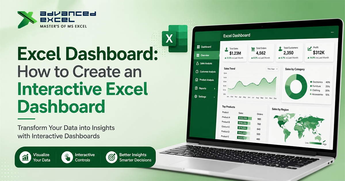
Slicers are particularly useful for interactive Excel dashboards.
7. Connect One Slicer to Multiple Pivot Tables
This is an advanced technique that can make your dashboard significantly more powerful.
Imagine your workbook contains:
- Sales by Region
- Sales by Product
- Sales by Salesperson
- Monthly Sales Chart
Instead of filtering each Pivot Table separately, you can connect one slicer to multiple Pivot Tables.
Steps
- Select the slicer.
- Go to the Slicer tab.
- Select Report Connections or PivotTable Connections.
- Select the Pivot Tables you want to control.
- Click OK.
Now one slicer can control multiple reports, provided the Pivot Tables share the appropriate data source or Pivot Cache.
8. Create Calculated Fields
Sometimes your source dataset does not contain the exact calculation you need.
A calculated field can allow you to create a new calculation within a Pivot Table.
For example:
Profit = Sales ? Cost
If your source contains Sales and Cost but no Profit column, you may be able to create a calculated field.
Basic Process
- Select the Pivot Table.
- Go to PivotTable Analyze.
- Choose Fields, Items & Sets.
- Select Calculated Field.
- Enter the calculation.
- Add the field to your Pivot Table.
However, calculated fields have limitations. For more complex calculations, it is often better to create the calculation in the source data or use the Data Model / Power Pivot.
9. Use GETPIVOTDATA for Reliable Reporting
When you click a Pivot Table value and create a formula, Excel may generate a GETPIVOTDATA formula.
For example:
=GETPIVOTDATA("Sales",$A$3,"Region","North")
This can be extremely useful when building reports outside the Pivot Table.
Instead of directly referencing a cell such as:
=B7
GETPIVOTDATA can retrieve a specific value based on the Pivot Table fields.
This makes formulas more reliable when the Pivot Table layout changes.
Tip
If you do not want Excel to automatically create GETPIVOTDATA formulas, you can turn off the Generate GetPivotData option from the PivotTable Analyze tab.
10. Create a Pivot Chart
A Pivot Chart provides a visual representation of your Pivot Table data.
You can create:
- Column charts
- Bar charts
- Line charts
- Pie charts
- Area charts
- Other supported chart types
For example, a Pivot Table showing monthly sales can be converted into a line chart to identify sales trends.
Why Use Pivot Charts?
They make it easier to identify:
- Growth trends
- Sales fluctuations
- Top-performing categories
- Regional differences
- Seasonal patterns
When combined with slicers, Pivot Charts can become an important part of an interactive Excel dashboard.
Advanced Pivot Table Tips and Tricks
Tip 1: Use a Proper Source Table
One of the biggest mistakes beginners make is selecting a fixed range such as:
A1:G500
Instead, convert your dataset into an Excel Table.
Shortcut
Press:
Ctrl + T
Then give the table a meaningful name.
For example:
SalesData
When new records are added to the Table, the data range can expand automatically.
This makes your Pivot Table workflow more manageable.
Tip 2: Keep Source Data Clean
Pivot Tables work best when the source data follows a proper tabular structure.
Your source data should generally have:
- One header row
- No completely blank rows
- No merged cells
- Consistent data types
- One record per row
- One field per column
For example:
| Date | Product | Region | Salesperson | Sales |
|---|---|---|---|---|
| 01-Jan | Laptop | North | Rahul | 75000 |
| 02-Jan | Monitor | South | Amit | 32000 |
Avoid designing your raw data like a formatted report.
Raw data should be structured for analysis, not presentation.
Tip 3: Refresh Your Pivot Table
A Pivot Table does not always update automatically when the source data changes.
If new records are added, refresh the Pivot Table.
Refresh Options
Right-click inside the Pivot Table and select:
Refresh
You can also use:
Data ? Refresh All
This becomes particularly important when a workbook contains several Pivot Tables connected to external or changing datasets.
Tip 4: Change the Default Calculation
Excel generally uses Sum when you place numeric data into Values.
But depending on the requirement, you may need:
- Count
- Average
- Maximum
- Minimum
To change the calculation:
- Click the value field.
- Select Value Field Settings.
- Select the required calculation.
For example, if you want to know the average order value, use Average instead of Sum.
Tip 5: Use Conditional Formatting
Conditional formatting can help highlight important Pivot Table results.
For example:
- High sales ? highlighted
- Low sales ? highlighted
- Negative profit ? highlighted
- Top-performing products ? highlighted
You can use:
- Data Bars
- Color Scales
- Icon Sets
- Custom rules
This can turn a basic Pivot Table into a more visually useful report.
Tip 6: Sort by Values Instead of Alphabetically
By default, Pivot Tables may sort labels alphabetically.
But in analytical reports, you may want to sort by performance.
For example:
Highest Sales ? Lowest Sales
How
- Select a value in the Pivot Table.
- Right-click.
- Select Sort.
- Choose the required sorting option.
This is particularly useful for identifying top customers, products, or salespeople.
Tip 7: Use Report Filters Carefully
Adding too many filters can make a Pivot Table confusing.
Instead, use:
- Slicers for important interactive filters
- Report Filters for less frequently changed criteria
- Value Filters for performance-based analysis
A good report should make the important information easy to access.
Tip 8: Rename Fields for Better Reports
Pivot Tables may display names such as:
Sum of Sales
For a professional report, you can rename it to:
Total Sales
Similarly:
Average of Sales
can become:
Average Order Value
Clear field names make your reports easier for managers and clients to understand.
Pivot Table vs Excel Formulas
Pivot Tables are not always the best solution.
Traditional Excel formulas may be more suitable when:
- You need a fixed report layout.
- You need calculations between individual cells.
- The report requires custom business logic.
- You need dynamic formulas using functions such as XLOOKUP, SUMIFS, COUNTIFS, or FILTER.
Pivot Tables are generally better when:
- You need quick data summaries.
- You need to analyze large datasets.
- You frequently change the way data is grouped.
- You need interactive filtering.
- You need quick management reports.
In professional Excel work, knowing when to use formulas and when to use Pivot Tables is just as important as knowing how to create them.
Pivot Tables and Power Pivot: What’s the Difference?
For larger and more complex analysis, you may eventually move from traditional Pivot Tables to Power Pivot.
A standard Pivot Table can summarize data from a worksheet or other supported sources.
Power Pivot extends Excel’s analytical capabilities by allowing you to:
- Work with larger datasets
- Create relationships between tables
- Build a Data Model
- Create DAX measures
- Analyze data from multiple related tables
For example, you could have separate tables for:
Sales
Customers
Products
Employees
Instead of combining everything into one huge worksheet, Power Pivot can create relationships between these tables.
This is one of the next steps for Excel users who want to move into advanced data analysis.
Common Excel Pivot Table Mistakes to Avoid
Even experienced Excel users can run into problems when working with Pivot Tables.
1. Using inconsistent source data
Different spellings such as:
- Gurgaon
- Gurugram
- gurgaon
may be treated as different values.
2. Blank headers
Every source column should have a meaningful header.
3. Mixing text and numbers
A Sales column containing both numbers and text can cause calculation problems.
4. Forgetting to refresh
Your Pivot Table may continue displaying old results if the source data changes and the Pivot Table has not been refreshed.
5. Using too many fields
Adding every available field can make a Pivot Table difficult to understand.
Start with the business question and add only the fields required to answer it.
Example: Building an Advanced Sales Analysis
Suppose you have the following sales dataset:
| Date | Region | Product | Salesperson | Sales | Cost |
|---|---|---|---|---|---|
| Jan 5 | North | Laptop | Rahul | ?80,000 | ?65,000 |
| Jan 8 | South | Monitor | Amit | ?40,000 | ?30,000 |
| Feb 2 | North | Laptop | Rahul | ?95,000 | ?72,000 |
| Feb 10 | West | Printer | Neha | ?55,000 | ?42,000 |
You could build a Pivot Table with:
Rows: Region
Columns: Month
Values: Sum of Sales
Filters: Product
Then add:
- Sales slicer
- Product slicer
- Pivot Chart
- Percentage of Grand Total
- Running Total
The result becomes more than a simple summary—it becomes an interactive analytical report.
Best Practices for Professional Pivot Tables
If you use Excel for professional reporting, follow these practices:
Keep raw data separate
Keep your source data in a separate worksheet from your dashboard or presentation report.
Use Excel Tables
Tables make data management and Pivot Table updates easier.
Use meaningful names
Name your tables, fields, and reports clearly.
Avoid unnecessary formatting
Too much formatting can make reports difficult to read.
Keep dashboards simple
The goal of a dashboard is to communicate information quickly.
Always verify totals
Before sharing a Pivot Table report, compare key totals against the source data.
Document complex calculations
If you use calculated fields, Data Model measures, or advanced logic, document what the calculation means.
Frequently Asked Questions About Excel Pivot Tables
What are advanced Pivot Table techniques in Excel?
Advanced Pivot Table techniques include date grouping, calculated fields, running totals, percentage calculations, Top/Bottom filters, slicers, Pivot Charts, GETPIVOTDATA, and connecting multiple Pivot Tables through slicers.
How do I create an advanced Pivot Table in Excel?
Start with a clean dataset, convert the source range into an Excel Table, insert a Pivot Table, and then use features such as grouping, calculated values, filters, slicers, and Pivot Charts based on your reporting requirements.
Can Excel Pivot Tables handle large datasets?
Yes. Pivot Tables are designed to summarize large datasets efficiently. For very large or complex datasets, Excel’s Data Model and Power Pivot can provide additional capabilities.
How do I refresh an Excel Pivot Table?
Right-click inside the Pivot Table and select Refresh. If your workbook contains multiple Pivot Tables or connections, you can also use Data ? Refresh All.
What is the difference between a Pivot Table and a Pivot Chart?
A Pivot Table presents summarized data in a tabular format, while a Pivot Chart presents that summarized data visually through charts. Both can work together for interactive reporting.
Why is my Pivot Table not showing new data?
The Pivot Table may still be using an old source range or may not have been refreshed. Using an Excel Table as the source and refreshing the Pivot Table can help prevent this problem.
Can I use slicers with Pivot Tables?
Yes. Slicers provide a visual way to filter Pivot Tables. They are especially useful for interactive Excel reports and dashboards.
Is Power Pivot better than a normal Pivot Table?
They serve different purposes. Standard Pivot Tables are excellent for everyday data summarization. Power Pivot is more suitable when you need multiple related tables, large datasets, complex calculations, or DAX-based analysis.
Final Thoughts
Excel Pivot Tables can do much more than simply calculate totals.
Once you understand features such as grouping, percentage calculations, running totals, Top 10 filters, slicers, calculated fields, Pivot Charts, and GETPIVOTDATA, you can create reports that are faster to build and much easier to analyze.
For professionals working with sales reports, financial data, HR records, inventory, operations, or business dashboards, learning advanced Pivot Table techniques can significantly improve productivity.
The key is not to use every Pivot Table feature at once. Start with the question you need to answer, choose the appropriate fields and calculations, and then add advanced features only when they make the analysis clearer.
With regular practice, Pivot Tables can become one of the most valuable tools in your Excel data-analysis toolkit.